Use the Note field when you want an area on a form for capturing variable length text. For example, shipping instructions on an order, justification for employee termination, description of inventory item.
On a data form (i.e. during data entry) text in the note field can be formatted: underline, bold, italic. Multiple formats can be applied to the same text. E.g. bold italic. Select text and use keyboard short cuts to apply formatting.
When the note field has keyboard focus it will expand in height to provide a larger area for typing text. It will contract to its configured height when the field loses keyboard focus. (more details)
Vertical scrollbars can be included when the note field is expanded.
Note field has a feature to insert text selected from a form stack into the field. This can be used to insert standardized phases into a note field. (more details)
Configuration aspects:
- Data Entry
- Allow/Not Allowed
- Scroll bar
- Scrollable/Not Scrollable
- Text Selection
- No text selection/Allow text selection
Creating a Note Field
Drag a Note field template from the column of field templates on the right of the form layout area. Drop the template on the layout area. Then click the new field to open the field designer.
Drag Note Field Template to Form Layout Area
Note Field Designer
Open the note field designer by clicking on a note field in the layout area. Close the designer by clicking on the background of the open field designer.
The Note field has two components:
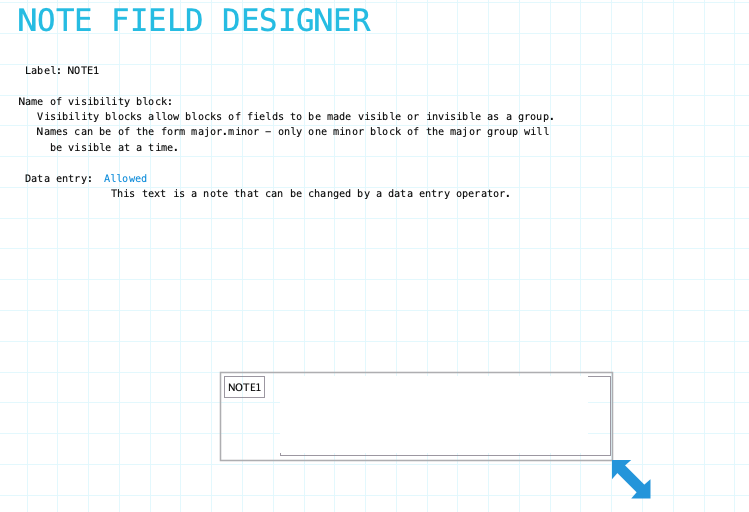
Label: Name of the note field. Provide a meaningful name even if the label is not displayed on the form. It is very likely that procedures or reports will refer to the field. To hide the field label drag it outside the bounds of the field. To edit the label using the Field Label Designer click on the label.
Name of visibility block: If the field needs to be visible or hidden or along with other fields on the form provide a name of a visibility block. See Visibility Blocks for details.
Data Entry: Indicate if data entry is allowed. Sometimes a field needs to be display only. This can be changed using form or field procedures. Choices: Allowed/Not Allowed
Resizing Note Field
See Field Designers for resizing a field.
Label Component
Note field has a standard field label. Click here to view field label designer details.
Input Component
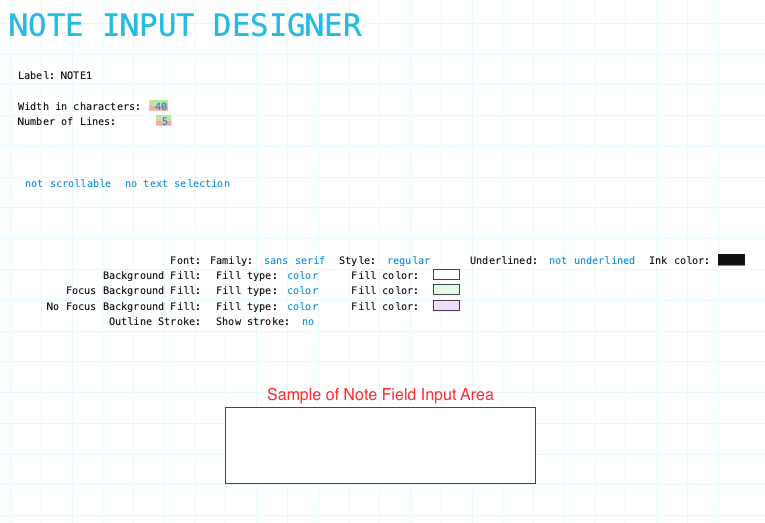
Width: Adjust the width of the input area. Adjust width by clicking the green portion of the digits to increase and the red portion to decrease.
Number of Lines: The number of lines height of the input area when the field does not have keyboard focus or the data form is open for viewing only. Adjust by clicking the green portion of each digit to increase and the red portion to decrease.
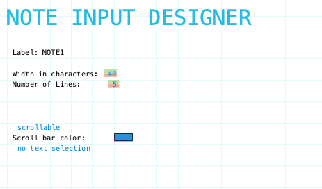
Not Scrollable: Indicate if the input area will have a scroll bar when there is more content than can be displayed in the expanded input area. Click to Scrollable to show scroll bar. Click here for detail
No Text Selection: Indicate if the input area support insertion of text from a form stack. Click here for details.
Input Component Attributes

Family/Style/Underline Ink Color: Font attributes of the input component text.
Background Fill: The fill for the input component field when the form is opened for viewing but not editing. Fill can be a color, transparent or various types of gradients.
Focus Background Fill: The fill for the input component when it has focus. Focus means it will accept input. Basically the cursor is in the field. This could only occur when the data form is editable.
No Focus Background Fill: The fill for the input component when it does not have focus. This is the normal background fill when the data form is editable. It is editable when either the data form is first created or when it is reopened for editing.
Outline stroke: Outline of the input component of the field. If Yes then the color and width of stroke can be set. Adjust outline stroke width by clicking the green portion of the digit to increase and the red portion to decrease the line width.
Input Component Expansion
The Note field input component automatically expands when the field has keyboard focus. It expands to 10 lines if configured to 5 lines or less and 20 lines if configured to 5-10 lines. It will contract to its configured size when the field loses keyboard focus.
If there is more content than can be displayed in the expanded area a vertical scroll bar will appear if configured to be scrollable. Otherwise no scroll bar will show. The content can still be scrolled line by line using the up/down arrow keys.
The scroll bar color can also be set when the scoll bar is configured to show.
Text Selection
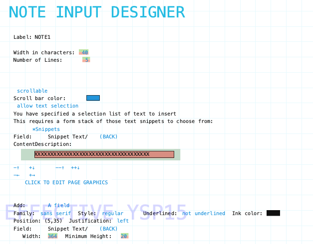
This is a feature of note fields that allows text snippets to be chosen and inserted in the text. This is used when the application has text that is commonly used but needs to be put in a text field. For example a system that is generating reports on some person or situation. There may be common phrases used all the time, even paragraphs. Rather than continually typing them, this feature allows the Director to select them from a list. It is common in these kinds of applications when writing reports to need to slightly edit theses words and/or to add other case dependent text to the report. This feature allows this to be done easily. Just select the commonly used text from the selection list that has been set up, it is inserted into the text at the current position and from then on it is just text that can be edited as normal.
The selection list can be set up to depend on other data so that the list of common phrases can be filtered to a subset that makes sense for the current situation.
Setup Text Selection
Setup text selection by completing the following:
- select the text snippets form stack
- select the text snippet field
- configure the text snippet selection list
To enable text selection. Click the no text selection text to toggle to allow text selection.
Select Snippets Form Stack
Prior to enabling text selection on a note field you need to have created an entity master form that holds a text snippet. It can be a simple entity with a code field and a description field. But it could also be something more complex. It depends on your system needs.
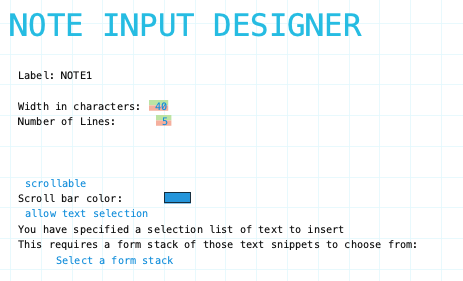
After enabling text selection on the note field the next step is to select which form stack to use for the text snippets. Click the Select a form stack text to be presented with form stack categories.
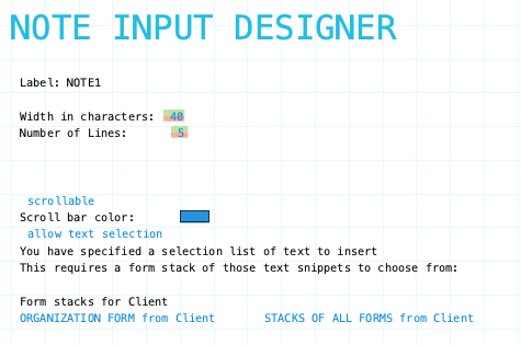
Select Text Snippet Field
After selecting the snippet form stack the next step is to choose the form field which contains the snippet text to be inserted.
Field categories of the form stack are presented once the form stack is chosen. Explore the categories to find and select the desired field. Remember only text fields (note or description) are valid fields. If you don’t see any fields the form stack doesn’t have a suitable text field. Why? Maybe you picked the wrong form stack. Maybe the form stack doesn’t have any text fields.
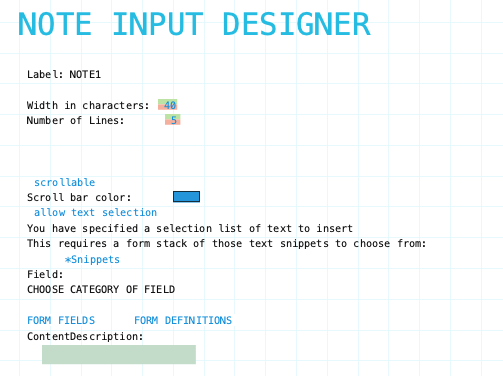
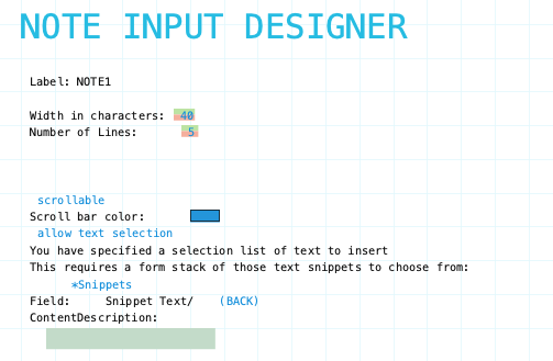
configure the text snippet selection list
The form stack of text snippets could have many data forms. To select the desired snippet a selection list is needed. Remember the snippet form is just another master form and like all master forms selections lists can be defined to view and select data forms.
Configure the Content Description text block to show the fields you want from the snippets form stack. The usual formatting options are available.
