Use the Pattern Text field on a master form for capturing formatted text data. For example, phone number (123)-456-7890, zip code (98362), postal code (v1t-4a5), multi-part numbers.
Pattern Text field uses a mask to limit the type and position of characters. It can also have a sequence number. Pattern text field can have up to eight parts.
Configuration aspects:
Data Entry
Allowed/Not Allowed
Field Data
Required/Optional
Creating a Pattern Text Field
Drag a Pattern Text field template from the column of field templates on the right of the form layout area. Drop the template on the layout area. Then click the new field to open the field designer.
Drag Pattern Text Field Template to Form Layout Area
Pattern Text Field Designer
Open the Pattern Text field designer by clicking on a pattern text field in the layout area. Close the designer by clicking on the background of the open field designer.
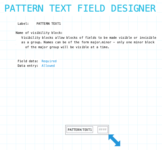
Label: Name of the pattern text field. Provide a meaningful name even if the label is not displayed on the form. It is very likely that procedures or reports will refer to the field. To hide the field label drag it outside the bounds of the field. To edit the label using the Field Label Designer click on the label.
Name of visibility block: If the field needs to be visible or hidden or along with other fields on the form provide a name of a visibility block. See Visibility Blocks for details.
Field Data: Indicate if the field must have data entered before the data form can be filed. Choices: Required/Optional
Data Entry: Indicate if data entry is allowed. Sometimes a field needs to be display only. This can be changed using form or field procedures. Choices: Allowed/Not Allowed
Pattern Text field has a standard field label. Click here to view field label designer details.
Input Component
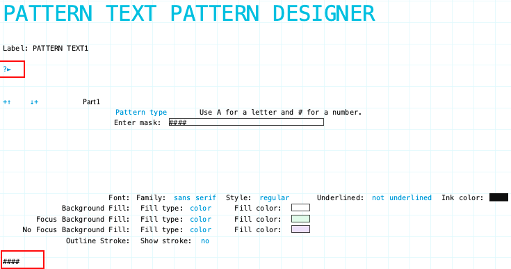
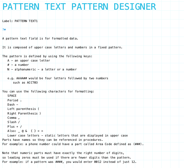
The ?> expands to provide help information about pattern characters.
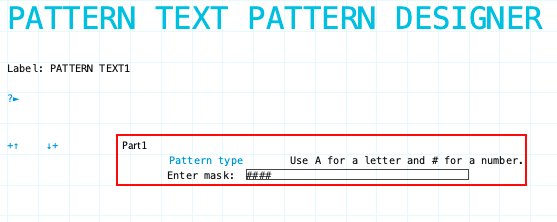
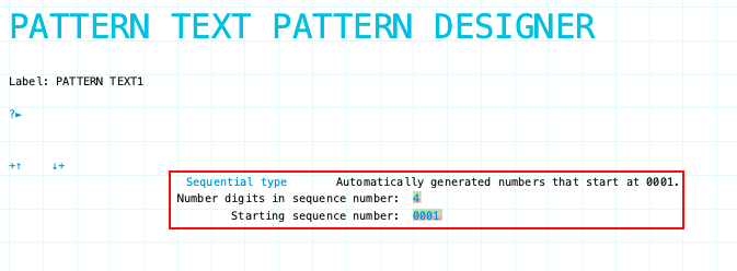
Combine up to eight parts to make a pattern text field. If a Sequence type is included in the Pattern Text field it must be the last part of any multi-part pattern text input component.
Adding Parts
Click the "plus-up/down arrow" icons to add a part to the pattern text field. A sample of the pattern text field will appear at the bottom left corner of the designer form so you can see what it looks like as you create the field.
Deleting Parts
Click the "x" icon to delete a part.
Pattern Text Input Designer Highlighting sample field and help icon
Pattern Type Part
Click the Pattern type or Sequential type text to switch between the two types. Enter the mask for the Pattern type. Refer to the input designer help expansion for valid characters.
Sequential Type Part
Click the Pattern type or Sequential type text to switch between the two types. For the Sequential type set the number of digits in the sequence number. Adjust by clicking the green portion of the digit to increase and the red portion to decrease the number of digits.
Adjust starting sequence number by clicking the green portion of each digit to increase and the red portion to decrease. The starting sequence number will be the sequence number issued when the first data form is filed.
Pattern Text Input Designer Help
Pattern Text Input Designer showing expanded help
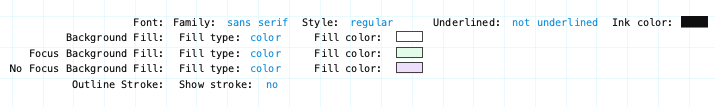
Input Component Attributes
Pattern Text Input Component Attributes
Family/Style/Underline Ink Color: Font attributes of the input component text.
Background Fill: The fill for the input component field when the form is opened for viewing but not editing. Fill can be a color, transparent or various types of gradients.
Focus Background Fill: The fill for the input component when it has focus. Focus means it will accept input. Basically the cursor is in the field. This could only occur when the data form is editable.
No Focus Background Fill: The fill for the input component when it does not have focus. This is the normal background fill when the data form is editable. It is editable when either the data form is first created or when it is reopened for editing.
Outline stroke: Outline of the input component of the field. If Yes then the color and width of stroke can be set. Adjust outline stroke width by clicking the green portion of the digit to increase and the red portion to decrease the line width.