Use the Date field on a master form for capturing a date. For example, person birthdate, prospect callback date, product expiry date.
Dates can be entered and displayed in a variety of formats.
Configuration aspects:
Data Entry
Allowed/Not Allowed
Date Format
Various
Default Date
Today/First day of accounting period/Last day of accounting period
Creating a Date Field
Drag a Date field template from the column of field templates on the right of the form layout area. Drop the template on the layout area. Then click the new field to open the field designer.
Drag Date Field Template to Form Layout Area
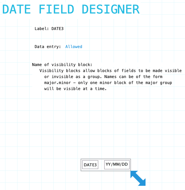
Date Field Designer
Open the date field designer by clicking on a date field in the layout area. Close the designer by clicking on the background of the open field designer form.
Label: Name of the date field. Provide a meaningful name even if the label is not displayed on the form. It is very likely that procedures or reports will refer to the field. To hide the field label drag it outside the bounds of the field. To edit the label using the Field Label Designer click on the label.
Name of visibility block: If the field needs to be visible or hidden or along with other fields on the form provide a name of a visibility block. See Visibility Blocks for details.
Data Entry: Indicate if data entry is allowed. Sometimes a field needs to be display only. This can be changed using form or field procedures. Choices: Allowed/Not Allowed
Date field has a standard field label. Click here to view field label designer details.
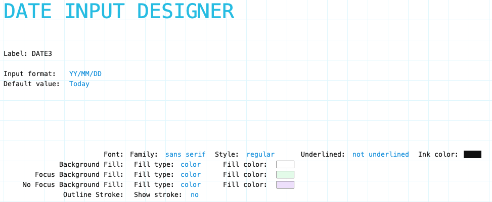
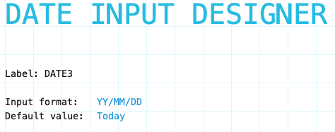
Input Component
Date Field Input designer
Input Format: Select the input format for the date field:
YY/MM/DD
DD/MM/YY
MM/DD/YY
YYYY/MM/DD
MM/DD/YYYY
DD/MM/YYYY
Default Value: Indication to Formever if data in the input component can be translated to another language. Choices are:
Today
First day of accounting period
Last day of accounting period
Input Component Attributes
Date Field Input Component attributes
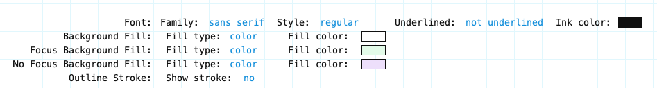
Family/Style/Underline Ink Color: Font attributes of the input component text.
Background Fill: The fill for the input component field when the form is opened for viewing but not editing. Fill can be a color, transparent or various types of gradients.
Focus Background Fill: The fill for the input component when it has focus. Focus means it will accept input. Basically the cursor is in the field. This could only occur when the data form is editable.
No Focus Background Fill: The fill for the input component when it does not have focus. This is the normal background fill when the data form is editable. It is editable when either the data form is first created or when it is reopened for editing.
Outline stroke: Outline of the input component of the field. If Yes then the color and width of stroke can be set. Adjust outline stroke width by clicking the green portion of the digit to increase and the red portion to decrease the line width.