Use the Date/Time field on a master form for capturing a timestamp consisting of a date and time. For example, start of timed task, prospect appointment.
Date and Time can be entered and displayed in a variety of formats and accuracies.
Configuration aspects:
- Data Entry
- Allowed/Not Allowed
- Date Format
- various
- Time Input Format
- various
- Time Granularity
- second/minute/5 minutes/10 minutes/15 minutes/30 minutes/1 hour
- Time Default
- midnight/noon/wall-clock
- Default Date
- Today/First day of accounting period/Last day of accounting period
Creating a Date/Time Field
Drag a Date/Time field template from the column of field templates on the right of the form layout area. Drop the template on the layout area. Then click the new field to open the field designer.
Drag Date/Time Field Template to Form Layout Area
Date/Time Field Designer
Open the date/time field designer by clicking on a date/time field in the layout area. Close the designer by clicking on the background of the open field designer.
The Date/Time field has two components:
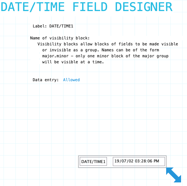
Label: Name of the date/time field. Provide a meaningful name even if the label is not displayed on the form. It is very likely that procedures or reports will refer to the field. To hide the field label drag it outside the bounds of the field. To edit the label using the Field Label Designer click on the label.
Name of visibility block: If the field needs to be visible or hidden or along with other fields on the form provide a name of a visibility block. See Visibility Blocks for details.
Data Entry: Indicate if data entry is allowed. Sometimes a field needs to be display only. This can be changed using form or field procedures. Choices: Allowed/Not Allowed
Resizing Date/Time Field
See Field Designers for resizing a field.
Label Component
Date/Time field has a standard field label. Click here to view field label designer details.
Input Component
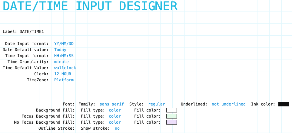
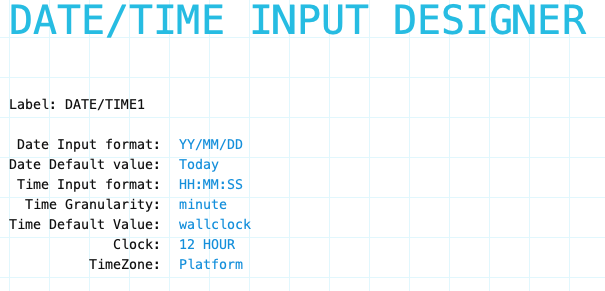
Date Input Format: Select the input format for the date portion:
- YY/MM/DD
- DD/MM/YY
- MM/DD/YY
- YYYY/MM/DD
- MM/DD/YYYY
- DD/MM/YYYY
Date Default Value: Select the default date for the date portion when a new data form is created.
- Today
- First day of accounting period
- Last day of accounting period
Time Input Format: Select the input time format for the time portion.
- HH
- HH:MM
- HH:MM:SS
Time Granularity: Select the accuracy of time. If typed into the time field it will be rounded to the specified granularity. If date/time is set by a procedure, then the time will be rounded to the specified granularity. This type of use is most common for situations in which the system is timing an activity. For example, timesheet for professional time billing system. An action field to start/stop a timer for an activity would fill in the date/time field when pressed.
Granularity Choices:
- Second
- Minute
- 5 Minutes
- 10 Minutes
- 15 Mintues
- 30 Minutes
- 1 Hour
Time Default Value: Select the default time for the time portion when a new data form is created.
- Midnight
- Noon
- Wallclock (the time right now)
Internal Time
Date/Time timestamps are stored as UTC value. Displaying/Printing is a designer/formatting issue. Depends on the report use.
Input Component Attributes
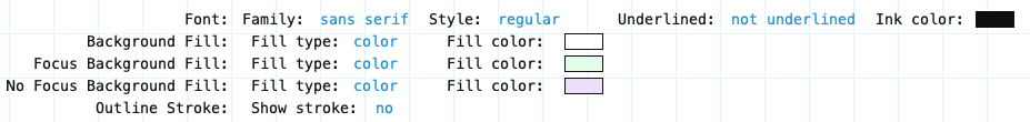
Family/Style/Underline Ink Color: Font attributes of the input component text.
Background Fill: The fill for the input component field when the form is opened for viewing but not editing. Fill can be a color, transparent or various types of gradients.
Focus Background Fill: The fill for the input component when it has focus. Focus means it will accept input. Basically the cursor is in the field. This could only occur when the data form is editable.
No Focus Background Fill: The fill for the input component when it does not have focus. This is the normal background fill when the data form is editable. It is editable when either the data form is first created or when it is reopened for editing.
Outline stroke: Outline of the input component of the field. If Yes then the color and width of stroke can be set. Adjust outline stroke width by clicking the green portion of the digit to increase and the red portion to decrease the line width.