Use the Choice field to offer a limited number of choices. The Choice field can be a checkbox list or a drop-down list. It can allow multiple choices or a single choice or no choice. It can be a single column or multiple columns.
Configuration attributes:
Style:
Check box style
Drop-down list style
Selection Type:
Must have one selected
May have none selected
Multiple Selection
Single selection (both styles)
Multiple selection (Check box style only)
Display field label
Data entry allowed
None chosen description
Creating a Choice Field
Drag a Choice field template from the column of field templates on the right side of the form layout area. Drop the template on the layout area. Then click the new field to open the field designer.
Play Video
Drag Choice Field Template to Form Layout Area
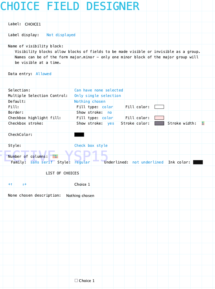
Choice Field Designer
Open the choice field designer by clicking on a choice field in the layout area. Close the designer by clicking on the background of the open choice field designer.
Choice Field Designer showing all configuration aspects
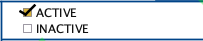
Single Choice
For some data entry forms a single choice option is all that is needed. For example, on a Project Expense form each expense item detail row might have a choice to indicate if the expense is recoverable from the client. You don’t need both choices (recoverable/unrecoverable) just the one choice. You also don’t need the choice field label in the detail row and it can be hidden.
In a report, however, what text should be reported for those expenses that are not recoverable? The choice field provides the None chosen description text attribute. More detail is provided below.
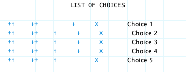
Choice Field Designer showing list of five choices
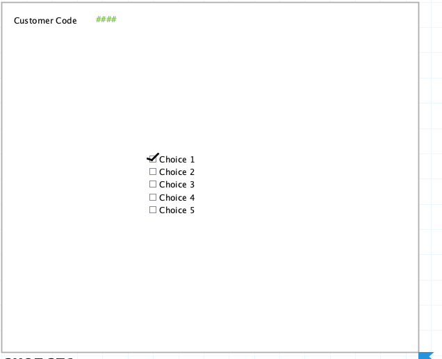
Checkbox style Choice field with five options on the Form Layout Area
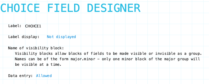
Choice field designer top portion of configuration aspects
Label: Name of the choice field. Provide a meaningful name even if the label is not displayed on the form. It is very likely that procedures or reports will refer to the field. The choice field label does not have a Field Label Designer.
Label Display: Indicate if the field label is to be Displayed/Not displayed on the form.
Family/Style/Underline Ink Color: Font attributes for field label. These appear and can be set when Label Display is set to Displayed.
Name of visibility block: If the field needs to be visible or hidden or along with other fields on the form provide a name of a visibility block. See Visibility Blocks for details.
Data entry: Indicate if data can be entered into the field. This can be changed using form procedures or fields procedures.
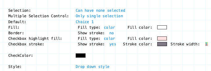
Choice field designer middle portion of configuration aspects
Selection: Specifies if a choice is required before the data form can be filed. Options are Can have none selected or Must have one be selected. If a selection is required the None chosen description field at the bottom of the designer will not appear as it is not needed. If a selection is not required the None chosen description field at the bottom of the designer will appear and you can provide the text to be shown or use the default description.
Multiple Selection Control: Specify whether multiple selections are allowed or only a single selection.
Default: Indicate the default choice to be selected. Default can be Nothing chosen or one of the choices from the list. Click to cycle through all the options.
Fill: This specifies the background color of the entire field.
Border: This specifies the border surrounding the field.
Checkbox highlight fill: This specifies the highlight shown for each choice in the field when cycling through the choices using the keyboard.
Checkbox stroke: This relates to the appearance of the actual checkbox that appears beside each choice. Specify the color of the stroke and width and whether to show the checkbox.
CheckColor: Specify the color of the checkmark that appears when a checkbox is selected.
Style: Dropdown list or Checkbox list
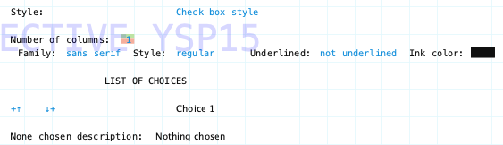
Choice field designer bottom portion of configuration aspects
Style: Dropdown list or Checkbox list
Number of Columns: Specify number of columns of choices for Checkbox style choice field. No affect on Drop-down list choice field style.
Family/Style/Underline Ink Color: Font attributes for choices.
None Chosen Description: This is used only for a choice field which does not require a choice to selected. This text will be shown in reports which include the choice field or in text blocks that include the value of a choice field. Default value is Nothing chosen.
List of Choices: This is where you specify the choices for the choice field. Click the "plus-up/down arrow" icons to add a choice to the list. A sample of the choice field will appear at the bottom of the designer so you can see what it looks like as you create the field.
Click on the name of each choice to change the text. Use the up/down arrow icons to rearrange the order of choices. Click the "x" icon to delete a choice.
Design Tip:
Do not add more choice options that are absolutely needed. Choice options can not be deleted once a data form containing the choice field has been filed in a fiscal period.
Choice options can be added when needed.
Choice options can be rearranged anytime.
Choice Field Designer showing list of five choices