Each field type has its own Field Designer. The field designer lets you configure everything about a field except for its position in the Form Layout area.
Accessing Field Designers
Click on a field to open the designer for that field. Close the field designer by clicking anywhere on the background of the field designer.
Resizing Fields
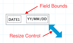
The area covered by a field is set using the double-head arrow in the bottom right corner of the field. The bounding box of the field will change as you drag the arrow. The bounding box will turn red if any of the field components extend outside the field bounds. In the Form Layout Area fields will turn red if they interfere with fields.

Field Components
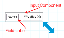
Most field elements have two components:
- Field Label component
- Input component
Some field elements will have more components. For example, the Quantity field also has a Unit component. Some have one component. If needed the field label component can be moved outside the field bounds to hide the label. Or move above/below or to the right of the input component.

Field Labels
The field label identifies the field. Default labels are assigned based upon the field type. E.g. Date1, Quantity2.
Minimum size of a field label is one character. Field Labels cannot be blank. Formever will not allow a master form to be filed with a blank label.
Field labels must be unique within the master form excluding Detail Lines blocks. Labels must be unique within a Detail Lines Block. Both can have similar field labels if needed. Formever will warn you if a label is too similar to another label. Formever does this using Human Equals comparison. It sees the following labels as equivalent: Start Date, start date, Start_Date, (start_date), StartDate. Regular humans would view these to mean the same thing. Programmers are different animals and see these as unique. But Formever is designed for regular humans.
Valid Characters for field labels: a-zA-Z _-%&+@#!?/()’ "
Click on the Field Label component to open the Field Label Designer and edit the label component. Click on the background of the Field Label Designer form to close the designer and return to the Form Designer.
Design Tips:
Descriptive meaningful labels are recommended. These will be more useful when choosing fields with the Field Chooser to create procedures, definitions and report designs.
Field Labels outside of the bounding box will not show with the field in the Form Layout Area. Such hidden field labels will still show in the Field Chooser.
Input Component
The Input component is the part of the field that accepts data, either entered by a director or displayed by the system.
Click on the Input component to open the Input Designer and edit the Input component Click on the background of the Input Designer form to close the designer and return to the Form Designer.
Each field type that has an input component has a unique Input Designer. For example, a Quantity field has a Number Input Designer, Date field has a Date Input Designer. See a field’s documentation page to learn about its input designer.
