In Formever every quantity is an amount of something. This is true of businesses in general. They deal with quantities of weight, volume, area, linear measures etc.
Use the Quantity field on a master form for capturing numeric data with associated units. For example, Prices $123.45, weights 45kg, liquid measures 5gal, or just simple counts, 6dozen.
The Quantity field supports many different types of units. For example, Weight, Volume, Area, Length, Energy, Temperature.
Quantity can also be a currency. For example $100USD, 40Euro. In multi-currency Formever systems alternative currency can be specified for a field so the currency can be selected at data entry time.
Quantity can be a rate. For example, $/hour, $/Gal, $/Yard. Rates are used, for example, to provide charge-out rates and material prices. Alternative rate units can be specified for a quantity field. At data entry time the appropriate rate can be chosen. For example, $/hour or $/day.
In multi-currency systems a quantity field can be an exchange rate. If a master form has an exchange rate quantity field then that ‘local’ exchange rate will be used when converting between the home currency and the exchange trading currency on that form. Without a ‘local’ exchange rate then the fiscal period exchange rate on the currency exchange form is used.
For more information about quantity, units, currency and exchange rates see Units of Measure
Configuration aspects:
- Data Entry
- Allowed/Not Allowed
- Sizing
- Digits before decimal point
- Digits after decimal point
- Quantity type
- Currency
- Unit
- Rate
- Exchange Rate
Creating a Quantity Field
Drag a Quantity field template from the column of field templates on the right of the form layout area. Drop the template on the layout area. Then click the new field to open the field designer.
The default quantity is a currency quantity in the home currency of the system.
Drag Quantity Field Template to Form Layout Area
Quantity Field Designer
Open the Quantity field designer by clicking on a quantity field in the layout area. Close the designer by clicking on the background of the open field designer.
The quantity field has three components:
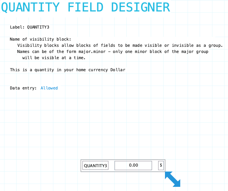
Label: Name of the quantity field. Provide a meaningful name even if the label is not displayed on the form. Quantities are definitely referred to by definitions and reports. To hide the field label drag it outside the bounds of the field. To edit the label using the field label designer click on the label.
Name of visibility block: If the field needs to be visible or hidden or along with other fields on the form provide a name of a visibility block. See Visibility Blocks for details.
Data Entry: Indicate if data entry is allowed. Sometimes a field needs to be display only. This can be changed using form or field procedures. Choices: Allowed/Not Allowed
Resizing Quantity Field
See Field Designers for resizing a field.
Label Component
Quantity field has a standard field label. Click here to view field label designer details.
Number Input Component
The number input component specifies only the numerical aspect of a quantity field. The units of a quantity are a separate input component. As you adjust the number input design a sample number input is displayed at the bottom of the designer form.
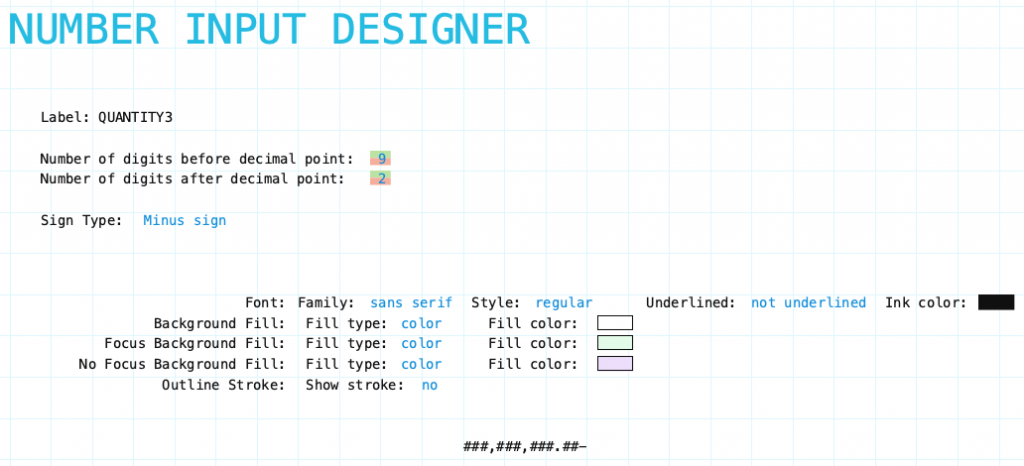
Digits before decimal point: Set the number of digits to allow in the field before the decimal point. Adjust by clicking the green portion of each digit to increase and the red portion to decrease.
Digits after decimal point: Set the number of digits to allow in the field after the decimal point. Adjust by clicking the green portion of each digit to increase and the red portion to decrease.
Sign Type: Click to select the sign type for the quantity field. Sign type is only used to display the sign – it does not affect the sign of the actual quantity.
Sign type choices:
- None
- Minus Sign
- Cr/Db with zero being a Credit
- Db/Cr with zero being a Debit
- Parentheses ()
Unit Input Component
The unit input component specifies the unit measure aspect of a quantity field. All quantities in Formever must have a unit.
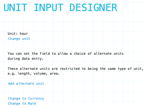
Unit: Current unit of the quantity field.
Change Unit: Click to change the unit of the quantity field.
Add Alternate Unit: Click to select alternative units for the quantity field.
Change to Currency: Click to change unit input designer to Currency mode.
Change to Rate: Click to change unit input designer to Rate mode.
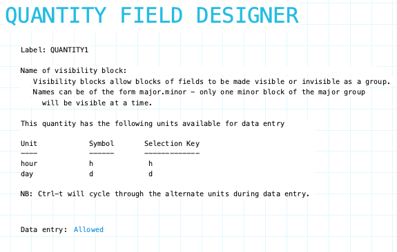
After designing the unit and alternative units for the quantity field the resulting field will be summarized in the quantity field designer form.
Currency Indicator
You can choose to indicate currency with either its currency symbol or currency code. For example $ or USD.
In multi-currency systems with home and/or trading currencies which have the same symbol (US $, Canadian $, Singapore $) Formever will modify the symbols so they are recognizable. The home currency, say USD, will keep always be the original symbol, $. The trading currency symbols (say Canadian $, Singapore $) will become CA$ and S$.
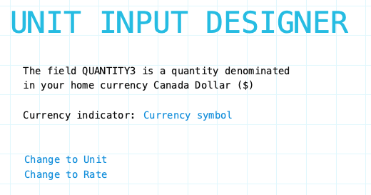
Currency Symbol: Click to switch between currency symbol or currency code. Eg. $ or USD
Change to Unit: Click to change unit input designer to Unit mode.
Change to Rate: Click to change unit input designer to Rate mode.
Rate Unit Mode
Use Rate mode to define a rate for a quantity field. Rates are expressed as currency per unit. For example, $/yard, €/Kg, ¥/Meter
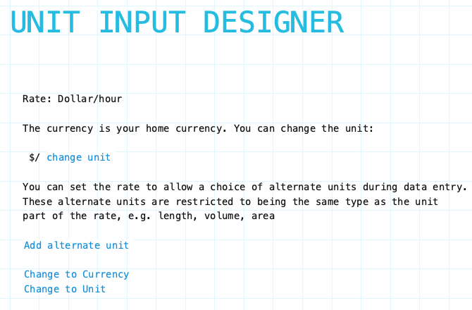
Rate: Current rate of the quantity field.
Change unit: Click to select unit of measure.
Add Alternate Unit: Click to specify alternative rates with different units of measure. E.g. $/hr, $/day, $/week. During data entry the alternative rate unit can be selected by using keyboard short-cut to cycle through alternatives.
Change to Currency: Click to change unit input designer to Currency mode.
Change to Rate: Click to change unit input designer to Rate mode.
After designing the rate and alternative rates for the quantity field the resulting field will be summarized in the quantity field designer form.
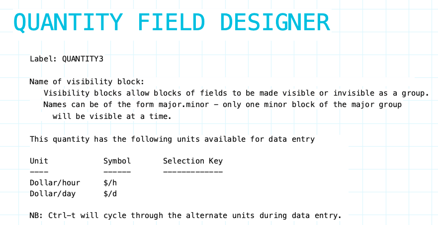
Input Component Attributes
The input component attributes only apply to the number component. The unit component is not affected.

Family/Style/Underline Ink Color: Font attributes of the input component text.
Background Fill: The fill for the input component field when the form is opened for viewing but not editing. Fill can be a color, transparent or various types of gradients.
Focus Background Fill: The fill for the input component when it has focus. Focus means it will accept input. Basically the cursor is in the field. This could only occur when the data form is editable.
No Focus Background Fill: The fill for the input component when it does not have focus. This is the normal background fill when the data form is editable. It is editable when either the data form is first created or when it is reopened for editing.
Outline stroke: Outline of the input component of the field. If Yes then the color and width of stroke can be set. Adjust outline stroke width by clicking the green portion of the digit to increase and the red portion to decrease the line width.
